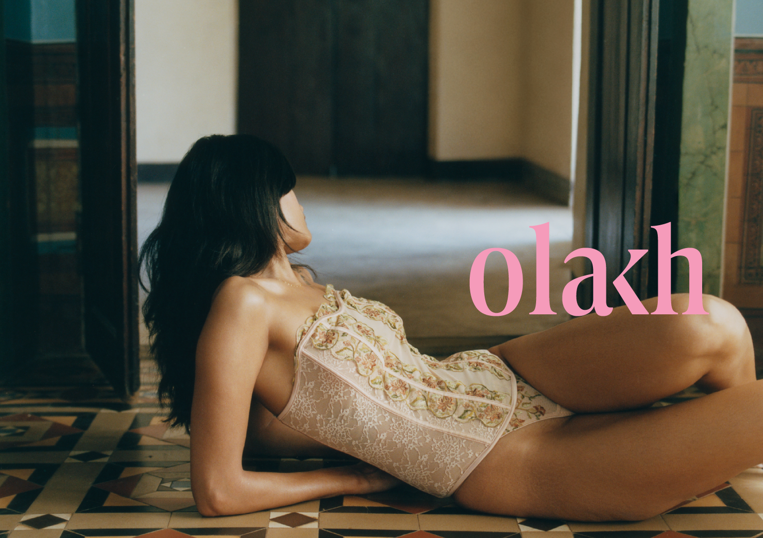
Photography: Bikramjit Bose. Images ©Olakh
Olakh began with a question from its founder, Tanvi Ghate: why does India not have its own language for lingerie?
My work was a response to it.
The category in India had been shaped by mass retail on one side and imported luxury on the other, and neither spoke to a woman who wanted something made with care, rooted in craft, and entirely her own. We positioned Olakh in that gap, built on four things: Indian craft heritage, custom sourced materials, fit led by expertise, and a sensuality that is interior rather than performed.
From there I developed the brand philosophy, the wordmark and logo, the visual direction, the photography style guide and the voice. At the centre sits the peach, a metaphor for something ripe, tactile and quietly indulgent. Together, they give Olakh a language that is unmistakably its own.
Creative Direction and Design: Pavithra Dikshit, 2025-2026
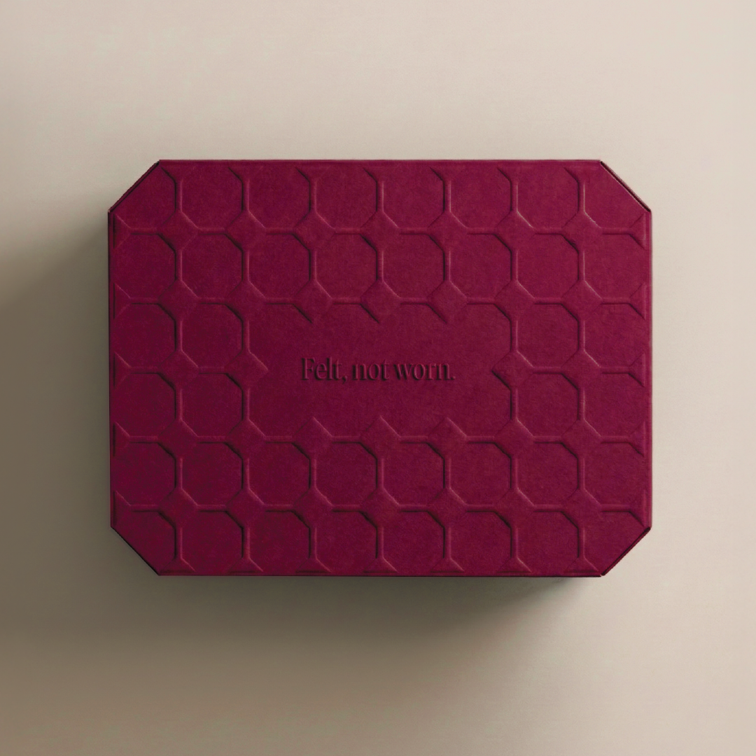
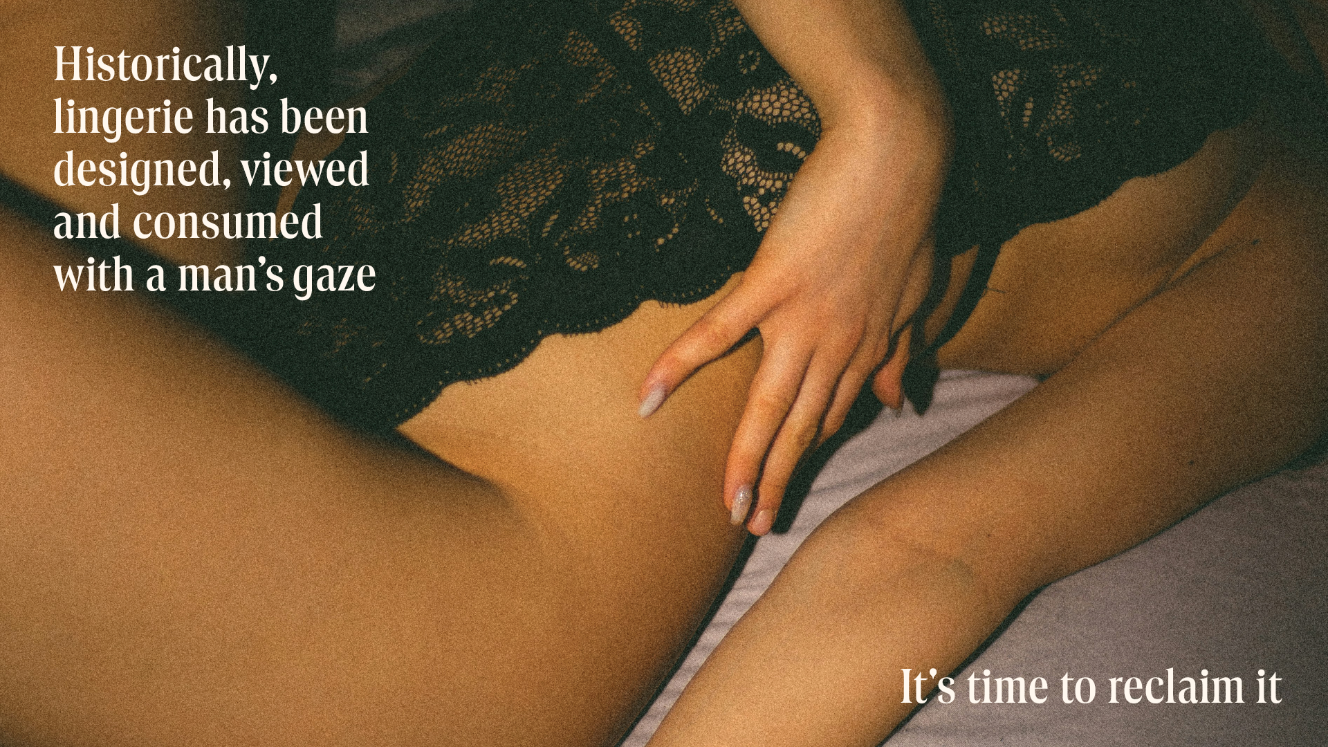
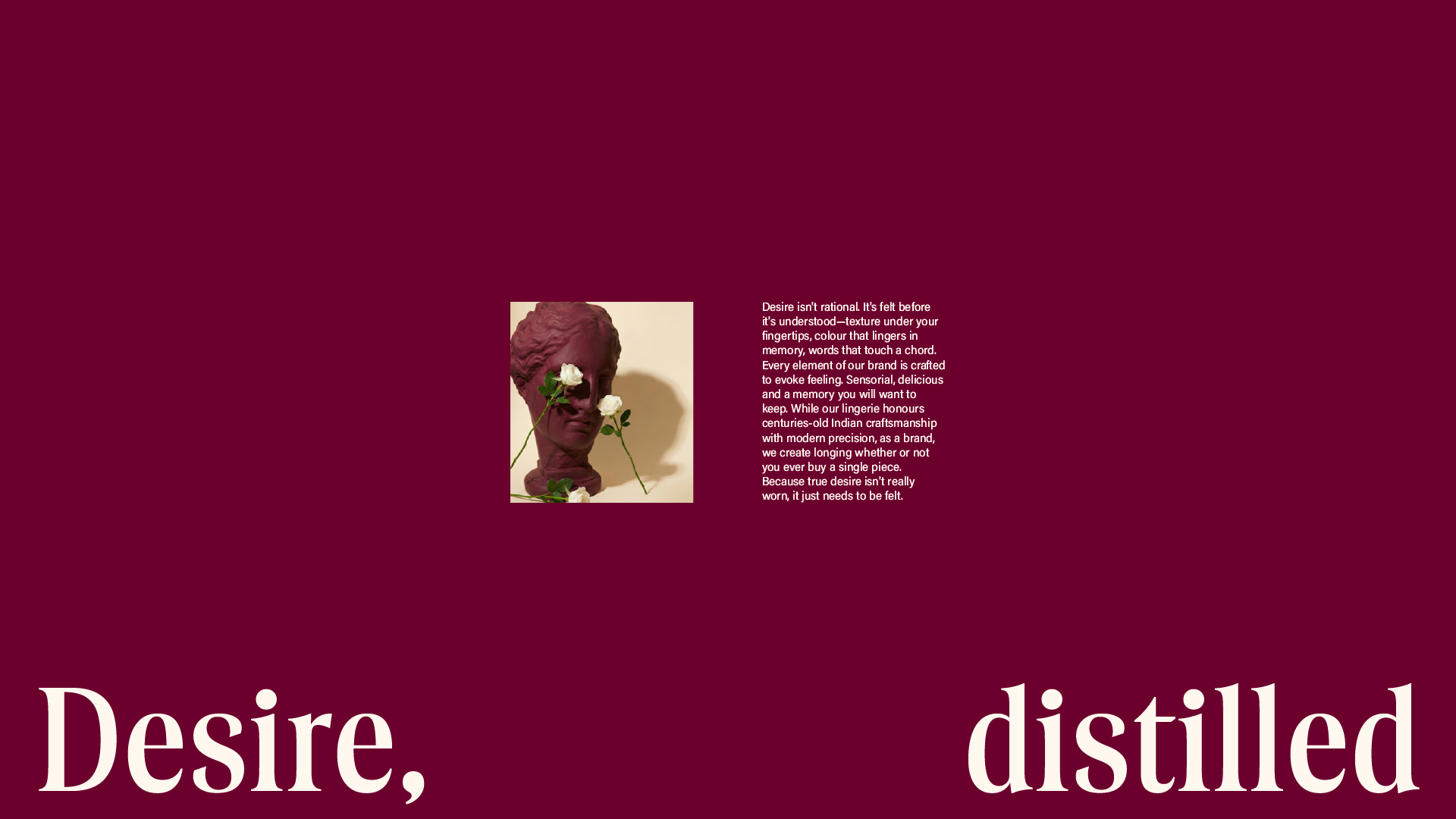
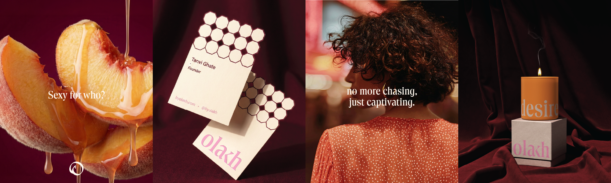
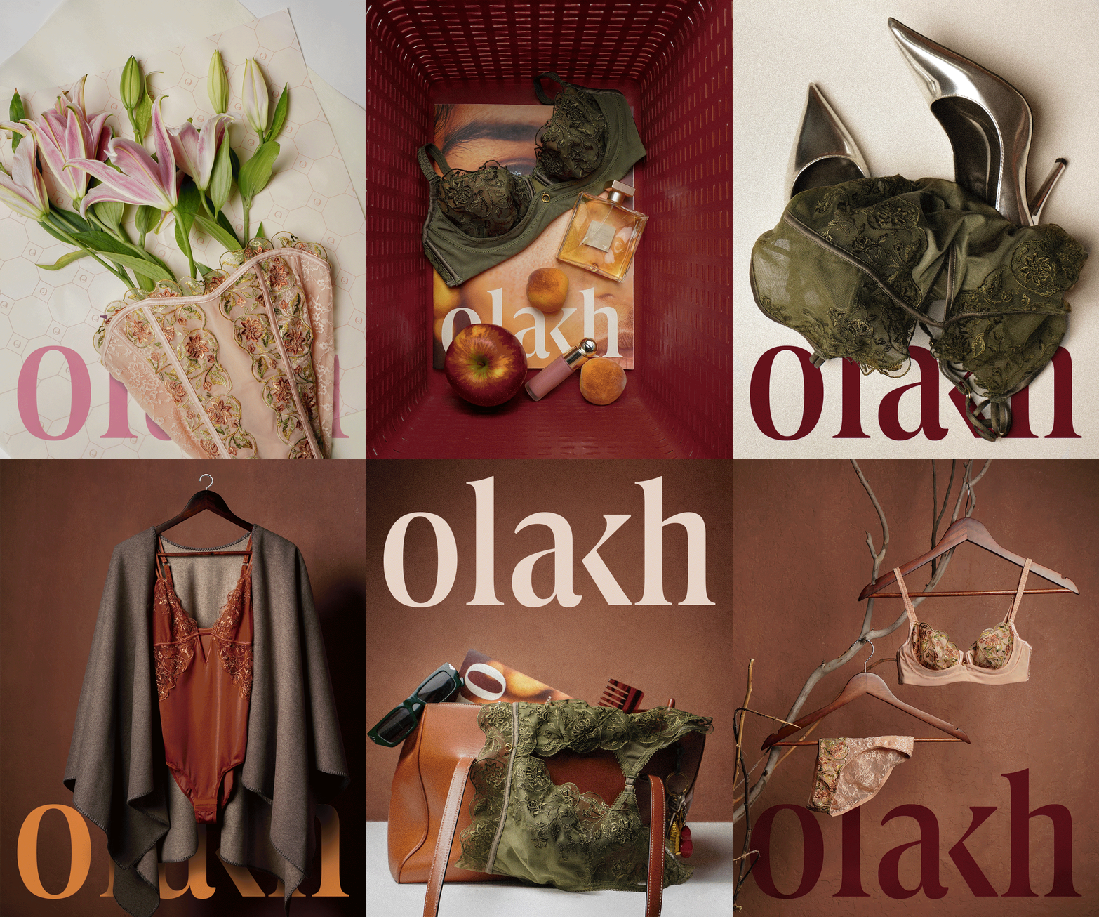
The voice was built to hold both wit and depth. It can be sharp and playful in a caption and slow and contemplative in an essay, without ever describing a pose or borrowing someone else's gaze. The same principle shaped the imagery direction, which sets aside boudoir conventions in favour of a woman's real world and the objects in it.
Photography: Bikramjit Bose. Images ©Olakh
Photography: Anish Mohan. Images ©Olakh

Photography: Tanay Bhatawadekar. Images ©Olakh